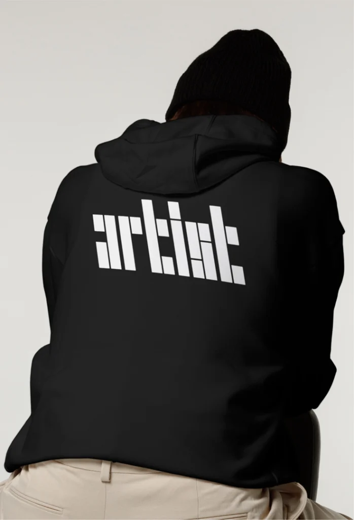
Behind the design of almost every typeface is an effort to balance curves with hard edges. But a new typeface from the agency Cotton Design uses just one shape—the backslash—to form every single letter in the alphabet, and somehow it makes perfect sense.
The font, called \Type, is part of a larger branding system created by Cotton Design for Backslash, an organization at Cornell University’s Tech campus that’s dedicated to exploring new concepts combining art and tech. Backslash describes itself as “unconventional” and “surprising”; to truly capture that spirit, Cotton Design took an equally outside-the-box approach in bringing its branding to life.

Along with the custom typeface, the agency reworked Backslash’s wordmark (also, you guessed it, backslanted), designed a new website, and created an infinite backslash pattern generator that’s worthy of a museum exhibition. It’s an avant-garde take on the rebrand that teeters between branding and fine art—a sweet spot that fits right in with Backslash’s ethos.
Designing a brand for an art and tech organization
Each year, Backslash awards a fellowship to a visiting artist to collaborate with Cornell Tech faculty and students on “a significant work of art that engages bleeding-edge digital research and technology.” Past projects have included NLP models built to preserve text by activists in South China, an augmented reality mobile app, and a live simulation software exploring “medieval christian indulgences mechanisms.” While these examples encapsulate Backslash’s boundary-pushing outlook, Talia Cotton, Cotton Design’s founder and the creative director of the branding work, says her team’s brainstorming actually began by looking outside the organization.
Through observing other brands in the space—like Rhizome, Net Art Anthology, Center for Art & Media Karlsruhe, and Yale School of Art—she says they realized the vast majority of similar companies have a “very brutalist, ‘undesigned’ design aesthetic” that Backslash could differentiate from.
“It was purposely kind of non-beautiful design, just weird and wacky,” Cotton says. “Experimentation is part of the Backslash ethos, but at the same time, when we spoke to the board and strategized about the brand, it was clear that what Backslash needed was an ownable brand. Something that, yes, might be a little more experimental, but still very controlled, systematic, and clear about exactly what it’s going to look like—so it can be recognizable and help create brand equity.”
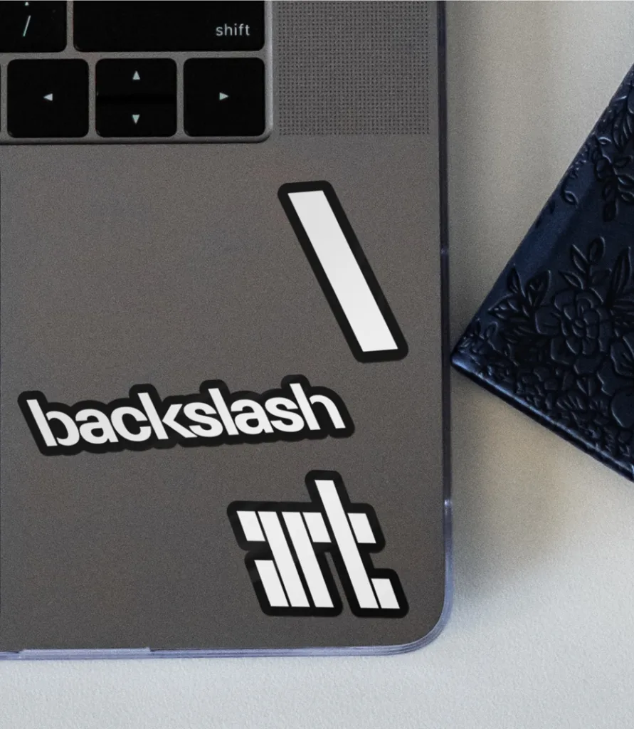
When Cotton first heard about Backslash from its founder, Greg Pass, she began iterating on the wordmark (which, at the time, was “\art”, pronounced “backslash art,” but would eventually evolve into simply Backslash): “I immediately went to my sketchbook and started sketching the word ‘\art’—in what ended up being the Backslash typeface,” Cotton says. “It was one of those rare moments of immediately ‘seeing it’ in my head and then just trying to make it work.
Later, when Cotton and her fellow designers Chris Kim and Noah Schwadron officially began work on the rebrand, they developed a basic typeface made fully out of backslashes, as well as at least six other possible concepts. Ultimately, though, Cotton’s first instinct—the \Type font—stood out from the rest.
“After lots of deliberation, Greg said, ‘We love all these other directions, but the Backslash typeface is just so us and so ownable. You have to move forward with it,’” Cotton says. “He became enamored with the challenge of reading it but how everything eventually comes into clarity.” [this last part of the quote is reading a little odd. can you make sure it’s right?]
Making a legible font out of a singular shape: Behind the creation of \Type
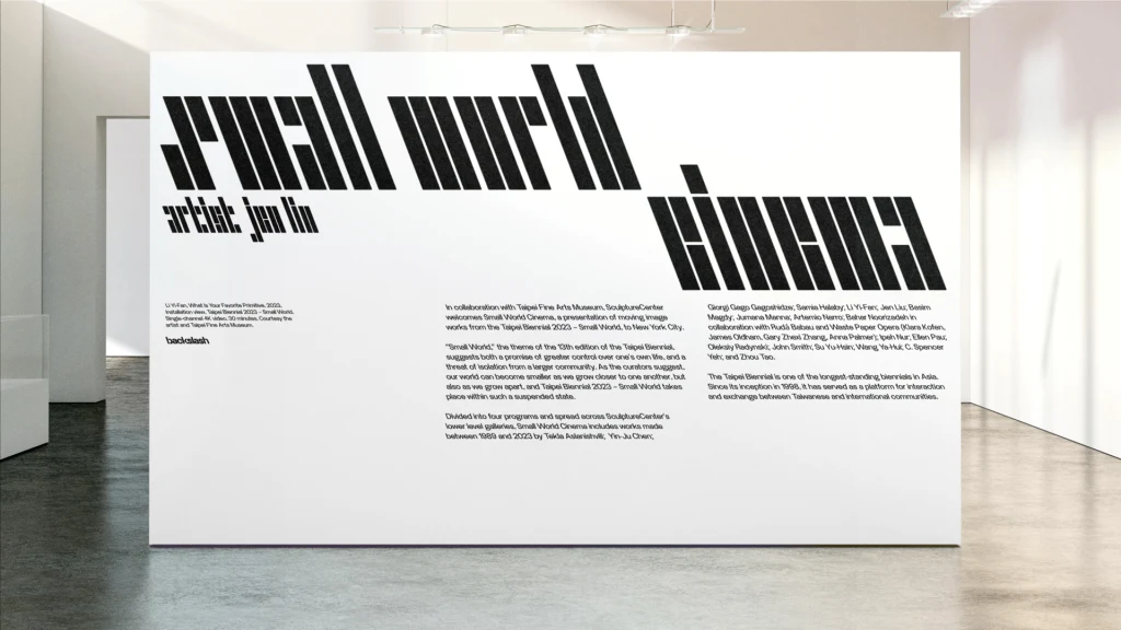
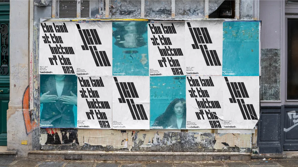
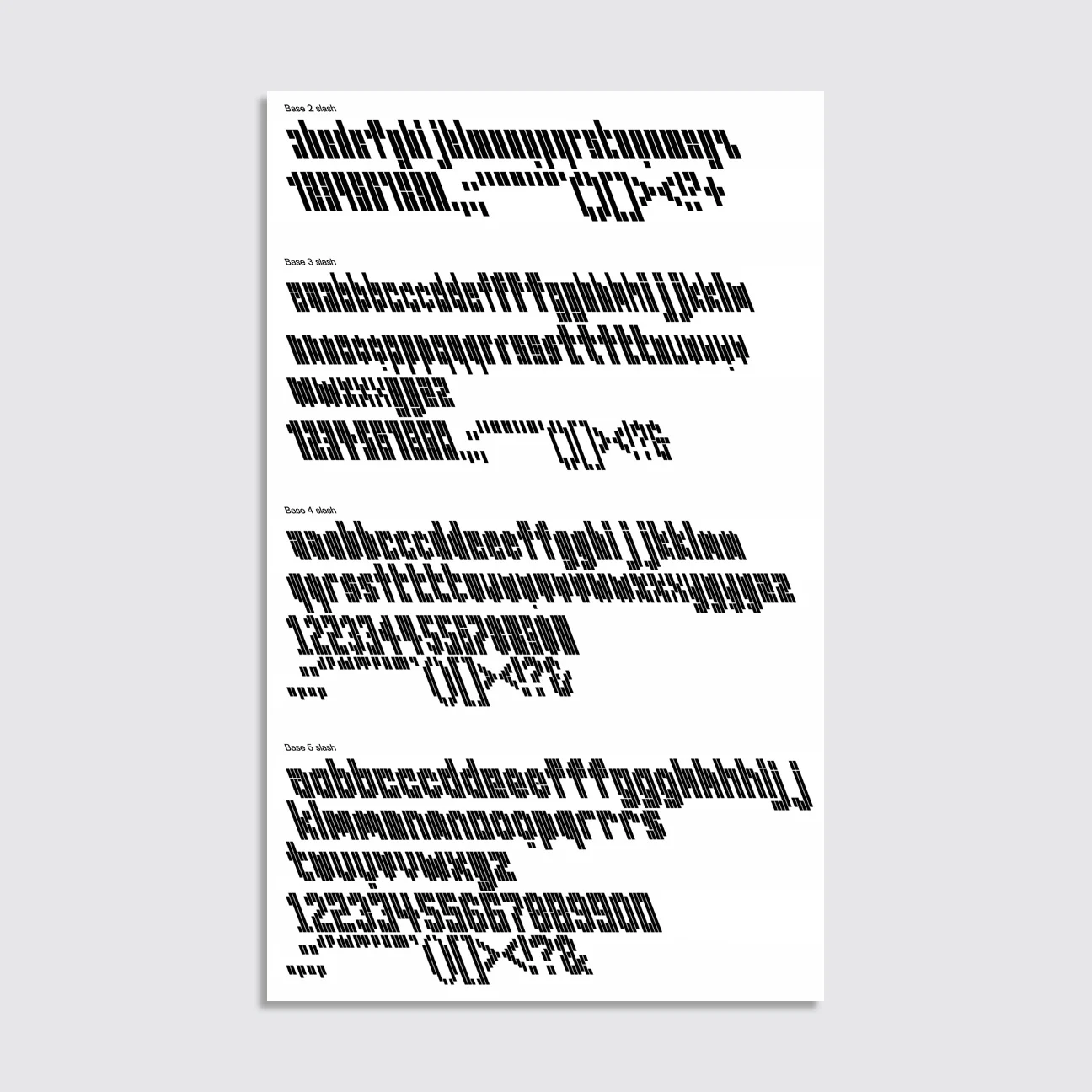
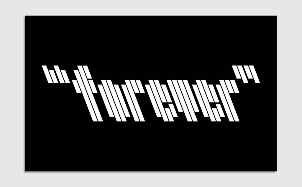
The final version of \Type is essentially a series of backslanted lines (tilted to 21°, the standard backslash angle), each of different heights, that create letters when combined. To preserve the backslash quality, all of the lines are oriented vertically. Due to these constraints, characters like a lowercase “n,” “u,” “o,” and “v” all share the same glyph—meaning, without other letters around them, they’re identical. Much of the work of deciphering the text rests with the viewer. Naturally, the brain fills in gaps in understanding to complete the more difficult words.
“What’s most amazing is that, even though they share the same glyph, you still have readable words because of the context,” Cotton says. “We had tested this quite a lot before showing that first presentation, just to make sure we weren’t incorrect. Amazingly, no matter the word, it always became clear.”
Still, Cotton says, there was a big challenge: After the first design presentation, Backslash’s board unanimously agreed that the original typeface “wasn’t legible enough for a brand that needed to be taken seriously.” They needed other options that could build out the branding in contexts where readability was key. So, back at the drawing board, Cotton’s team set about creating four new line weights of \Type with more backslashes making up each letter. “The idea was that the further you move along in the system, the clearer the details and silhouette of the typeface become,” Cotton says.
In digital formats, like Backslash’s new website, simply hovering over any use of \Type allows the user to cycle through line densities, easily decoding any tricky words. Certain symbols are especially fun to play with, like the ampersand, which appears as a plus sign in the two-strand weight and mimics a different style ampersand as the line weight increases.
“I think what the interactivity does is it allows people to take a moment with the two-strand weight, and if they don’t understand what it says, human nature is to play with it—to see if it turns into something else or if they can make sense of it,” Cotton says. “Discomfort on the web—on ‘designy’ websites—often translates into a brief moment of exploration.”
Pushing the boundaries of the backslash
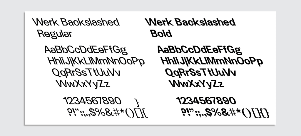
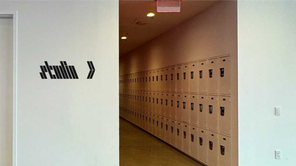
Beyond the \Type system and website, Cotton’s team also created a slate of other assets for Backslash. The organization’s new custom wordmark uses an existing font called Werk Sans, which has been slanted 21° backwards and edited so that the straight lines in “b,” “k,” and “l” each look like their own backslashes. Backslanted Werk Sans also serves as the base text for the Backslash’s new-and-improved website. Cotton Design even made a series of emoji-style backslash icons for the Backslash crew to use as reply buttons in Discord.
But perhaps the most fascinating part of the branding work is a project that provides Backslash with an unending repository of assets to display on their website, promotional materials, and more: an infinite backslash pattern generator.
“A designer on my team, Noah Schwadron, one day showed me a really random, weird, fractal-based slash pattern he had made with backslashes,” Cotton says. “It was based on “Rule 30,” a visual concept based on cellular automata (really nerdy creative coder kinda stuff). While it was incredibly cool, it also wasn’t beautiful—there was something off-putting about how the random numbers came together to create this pattern generator. I tried to anchor it in something more visually appealing, and we talked a lot about what that would mean.”
The answer, she says, was turning to the centuries-long tradition of weaving for inspiration.
“Weaving is often numbers-based and algorithmic, which relates to the Backslash brand, because Backslash is rooted in technology, but also has an artistic and crafty side,” Cotton says. “There is also something beautiful in the eventual symmetry of weaving. And lastly, there are inherently an infinite number of types of patterns that can be made. So, we took a look at a lot of different weaving patterns and said, ‘What if we created these patterns using backslashes?’”
With the humble backslash as its only shape, the tool is coded to create intricate works of art in styles that feel distinctly human. To view the pattern generator, one need only hit “\” while browsing the Backslash website. Like the rest of the rebrand, it’s a visual encapsulation of Backslash’s goal to push the boundaries within art and tech spaces—a concept that, not so coincidentally, is also the basis of the backslash character itself.