This year was all about Brat Green, Pantone Peach Fuzz, and mustaaaaaaaard. We’re hyped for a 2025 slathered in Pantone Mocha Mousse. But, with all due respect to Prince, I want to talk about a color that should never get a year: purple.
Let me count the heinous hues: plum, lilac, orchid, lavender, violet, mauve.
Barf.
As Fast Company’s creative director, I love color. My job is to use color to create meaning and evoke emotion. But I try* to steer clear of purple—it’s a confused color, unsure of what it’s trying to say.
To analyze purple’s confusing nature, I spoke with Lee Eisenman, the executive director of the Pantone Institute. “Purple has the excitement of red, but the calmingness of blue,” she says, noting that while orange is also a secondary color, its red and yellow components share warm messaging. Fair. But in the world of branding, purple mumbles with indecision. Purple feels like a client that can’t choose a direction and a designer eager to wrap up the project: Lets just pick purple and call it a day. And when brands settle for indecision, they miss out on making an emotional impact.
Decisiveness drums up emotion. Red energizes a brand; blue soothes it. But purple makes a brand feel emotionally torn, perplexed, ambivalent.

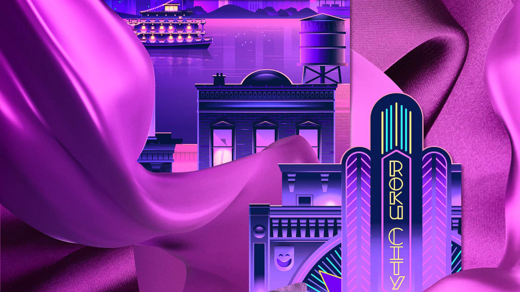
Consider Roku and its color battle with other streaming services. While Amazon Prime’s blue pours me onto the couch, Hulu’s green sprouts my interest in fresh content, and Netflix’s red fires me up to watch the screen, Roku’s purple leaves me feeling cloudy. What are they trying to say? While the top-tier streaming services snagged the good colors, it feels like Roku smashed the purple button as an easy way to stand out. Conversely, Roku comes across as second-rate due to its use of purple without clear messaging.
Eisenman, who consulted with Roku on its purple hue, said the company wanted to grab a “second look from a consumer by creating a sense of mystery.”
Ready for me to solve that mystery?
Here’s our collective experience: purple is the color of pop-culture psychopaths. In the Batman franchise, The Joker, fitted in a purple suit, constantly tries to blow up Gotham City. In Willy Wonka & The Chocolate Factory, our purple festooned ferryman takes the Salt family on a dark tunnel ride, terrorizing their minds with creepy projections of crawling millipedes. In Avengers: Endgame, Thanos, the purple-skinned alien warlord, snapped his fingers and ended half of humanity. If only he could’ve ended Barney, that furry purple dinosaur who haunted children with his song, “I Love You.”

Oh, and that smiling purple devil emoji? Total asshole. 😈
Despite our villainous associations with purple, brands often use the color to communicate a contrived sense of luxury and pomp. Consider Cadbury and Hallmark. Cadbury slaps some purple on their wrapper, signaling their chocolate is of the highest distinction. Meanwhile, beneath the wrapper, the chocolate is overly sweet and creamy, which masks the subpar quality. And Hallmark—have you ever watched one of its movies, especially around the holidays? In A Gingerbread Romance, an architect and a baker fall in love during a contest to produce a gingerbread house. It feels like the frenzied Hallmark writers chugged bottles of Robitussin and coughed out these stories, which are sticky-sweet, artificially flavored hallucinations of romance. That’s the real flavor of purple.
To dive deeper into purple’s artificial luxury, I also spoke with Brian Collins, a branding expert and Chief Creative Officer of COLLINS. He pointed to Rolls-Royce’s recent rebrand as a poor use of purple. The rebrand uses a purple gown, mimicking Rolls-Royce’s iconic hood ornament. “It falls flat as it deploys little new imagination,” he says. By relying on the familiar purple symbol to convey luxury, Rolls-Royce comes across as cheap and easy.

These aforementioned brands want us to associate purple with luxury, but associations require experience—and while we’ve experienced purple villains, most of us haven’t experienced purple luxury. Eisenman explained that purple’s luxurious associations date back to 1200 BC, when only the rich could afford the laborious process of extracting purple dye from the shells of Murex snails, creating the rare and coveted Tyrian purple. So, unless we can hop into a time machine, we’ll never experience the true luxury of purple.
So, can a brand successfully use purple to communicate luxury? Collins, though not a smoker, cited the cigarette brand Silk Cut as a success. In its classic advertisements, the brand repurposes a purple silk scarf in surprising ways. The scarf becomes a body of water traversed by a boater, a troop of leaves carried by ants, and even a veil of threads extruded from a meat grinder. This advertisement forced me to imagine their meat grinder as a precise machine, capable of extruding these purple fibers into the finest filigree. I’ll give it to Mr. Collins—Silk Cut made purple feel high-end. Unlike Roku, Silk Cut’s messaging was clear.
But I still hate purple.
Eisenman said it’s rare for a creative person to bear such a grudge towards purple, and Collins commented that I must have a deep-seeded hatred for the damn color. So join me on the therapist’s couch, won’t you?

In college, I dated a girl whose mom hated me for no good reason. When I’d knock on the front door, she’d greet me with a purple laser-beam stare. The inside of her home was adorned with wall-to-wall purple carpeting. There were purple curtains. Purple pillows on all of the couches. Purple napkins on all of the tables. It was a puke-y purple palace of coldness, and it forever changed the way I saw the color.
My distaste is a concept known as affective conditioning, where my emotional experience influences my attitude towards color. Or, as Collins said, “purple scarred me for life.” 😈

Can affective conditioning apply to other colors? Of course. Color is an individualized experience. But purple is a tricky one. It straddles warmth and coolness. It can be easily confused as artificial. It carries so much mystery. Purple creates a blank slate, leaving too much space for the audience to apply their own affective conditioning, making it a volatile color choice.
Prince owned purple because he played guitar like no one else. His artistry redefined purple. Designers who dare to use purple to make a brand look luxurious, romantic, or creative, must rise to a similar challenge. They have a responsibility—to themself, to their audience, and to Prince himself—to wield the color with decisiveness and to use it in surprising ways that challenge expectations.