There’s an old cliché that you can’t be everything to everyone. Design platforms of late are on a mission to prove otherwise.
Figma is the latest example. Today, the company is launching a refreshed visual identity that represents its growing, post-Adobe breakup ambitions to be, well, just about everything. Figma’s been making moves to expand beyond its founding idea of being being a single product company for designers, to a multi-product company for multi-role creative teams. Now, the company’s refreshed brand is catching up and speaking to an expanded audience that includes developers and supporting team members like project managers, who help bring a design deliverable to life.
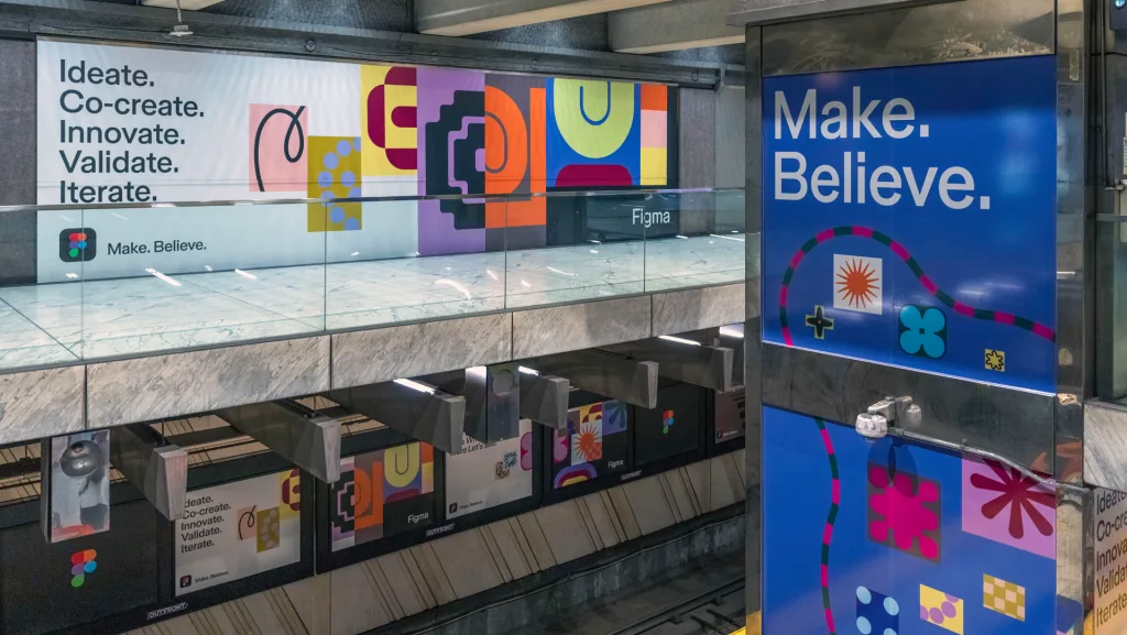
The update is colorful, quirky, and a bit more abstracted than its last refresh in 2019—but its underlying strategy is crystal clear. It’s using copy and visual references that connect the product to broader audiences, and in turn, the company with major growth opportunity.
Time for a refresh
Figma has had a big year. Following the breakdown of its $20 billion deal with Adobe last December, the company has been working rapidly to right the ship. It has prioritized the expansion of dev mode, an in-platform mode that transfers designs into code that it first launched in June 2023. It redesigned the product’s UI, introduced Figma Slides so users can create presentations, and integrated new gen AI tools, which it of course calls Figma AI. In late July, Figma added new investors to a $12.5 billion valuation.
Figma’s ambition to expand its value prop from a designer tool to collaborative product suite is not unique to the company. While their original concepts all touch different points of creative processes, Adobe, Zoom, Slack, Notion, Canva, WordPress, Wix, Squarespace and, well, pretty much any creative platform you use for one thing wants to be the one platform your team uses for everything, as a way to keep users in-product. Zoom added team chats, Slack added video, web builders all have dev capabilities to court those users, and many now allow co-editing, which Figma pioneered. It’s not about design work, it’s about design workflows!
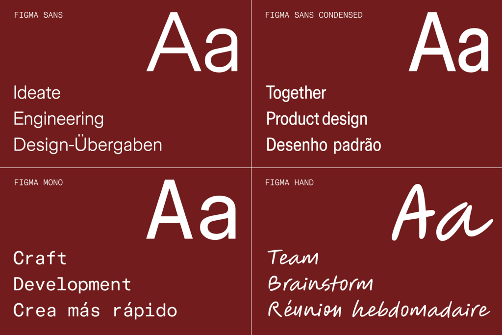
This is clearer than ever with Figma’s brand refresh. The brand introduced its own bespoke typeface with Grilli Type, Figma Sans. It’s a pared-down version of the typeface the company used before, which had super exaggerated inkwells. The new wordmark uses the same typeface, which slims its once super round, humanist sans counters that were popular among aughts-era tech startups. They designed both to be a somewhat neutral, flexible counterpart to its otherwise colorful brand. The team, led in-house by creative director Damien Correll, also introduced Figma Mono, a secondary bespoke typeface that the company will use to speak to its developer audience.
Building a new Figma brand
The iconography in the new branding system is also more abstract, playful, and whimsical. “Our visual language is still unapologetically graphic,” says Correll, nodding to Figma’s design purist origins. The imagery used throughout Figma’s branding is abstract, rather than literally depicting the design process in Figma.
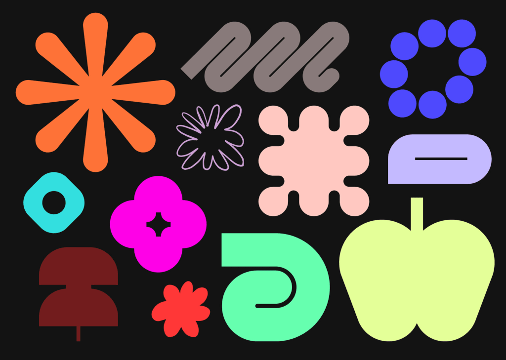
The team designed the new symbols around three themes: ideate, design, and build, signifying design isn’t a step in the process but the whole damn thing. That fits nicely with one of Figma’s brand beliefs, which informed the strategy: “design is everyone’s business.” According to Correll, that means “Design isn’t a skill or department, it’s a way of making,” and the brand is meant to visually convey that with little details that signify craft as well as symbols that convey interaction and nod to code in addition to vectors.
According to Correll, Figma’s user base breaks down as a third designers, a third developers, and a third the other supporting design team roles. “We’ve taken incremental steps to speak to a dev audience, and that’s been on the product side as we build more robust tools, but they needed a visual language that speaks to them,” says Correll. Years ago, Figma pioneered design co-editing, which it called out with cursors. The cursors are now gone. Correll now feels it’s “important to show off Figma as a pioneer of visual collaboration.”
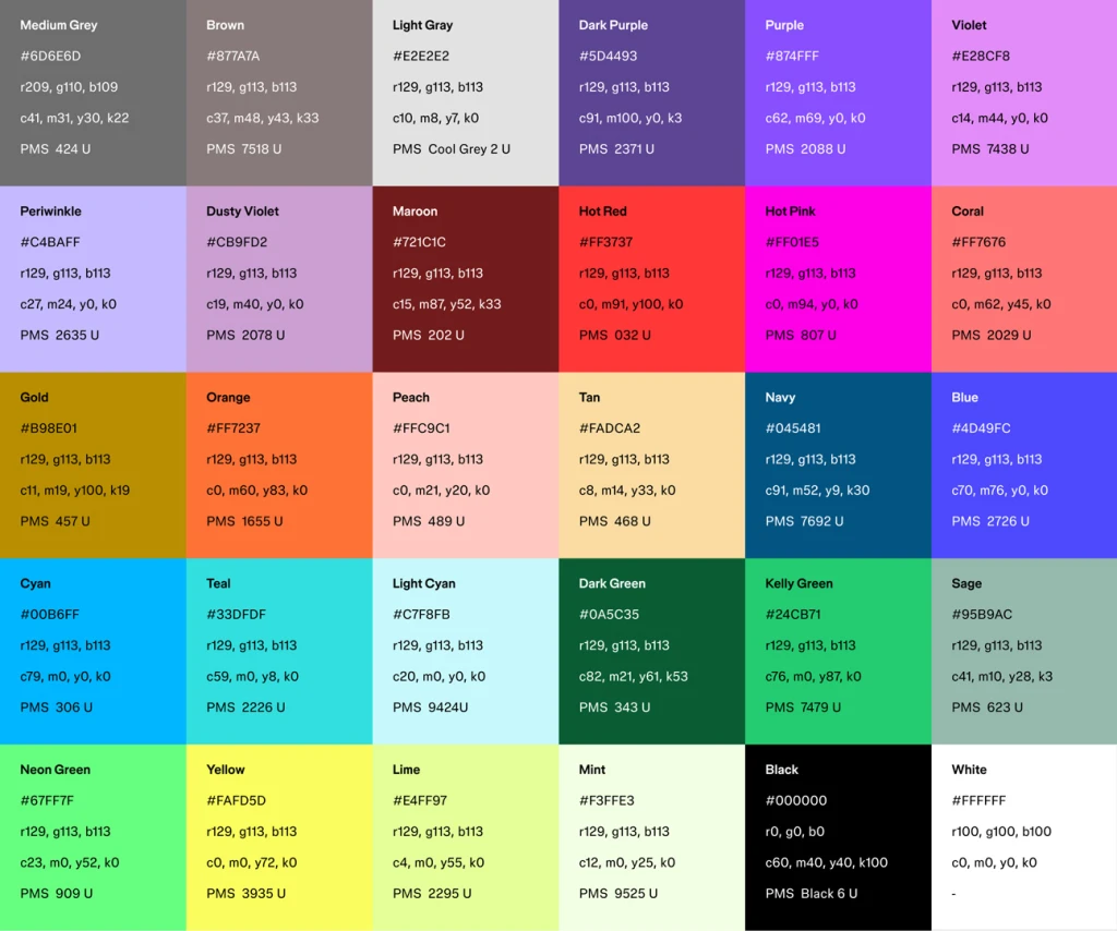
The brand colors seem to be more about conveying a feeling than a rigid system (although if you want to get into the weeds, yes they do have a set of brand colors with specific hex codes). Just like members of a team, the visual brand’s array of colors are paired together in a lot of different ways, and they have to play nice.
“We’re not a brand that says, you know, orange is our color,” says Correll. “Or this predictive blue is our color. Those are, in my opinion, older ways of thinking about brand building. Unless you’re a heritage brand like Nike or IBM, you can’t own orange and blue, right? They were first and they’ve built equity in it over years. How we think about color is trying interesting pairings. It’s a spectrum. We have certain things up, and sure we might over-index on two colors in that spectrum, but over time this will feel consistent with Figma and you’ll understand it as a Figma ad or a Figma website.”
Reaching a bigger audience
The refresh is ultimately about repositioning Figma, and making sure those expanded capabilities are known on the part of existing users and potential ones. “Design is the gravitational center for us, and we are making sure that we’re making a platform that works for a lot of people and for a lot of people to do their job really well,” says Correll. “We do want to make sure though that others can feel like they can participate at a professional level in the design process, and it’s not just something being applied to them, or that they’re being handed off a complete design.”
It’s also designed with future growth and broader reach in mind. “We intentionally built the visual language to be a little bit open-ended and a bit more flexible for that growth,” says Correll. “This was a direct learning coming out of the previous visual direction. We wanted to make sure that this was something that we could use today and evolve over time, like the design process. There are more interesting ways that we can use it that we get to uncover.”