Tim Walz isn’t the only Minnesotan making news. The state’s lead newspaper, the Minneapolis Star Tribune, recently relaunched as the Minnesota Star Tribune. The name change signals a shift from a Twin Cities-focused publication (one of the largest dailies in the country) to one that will expand its coverage, hire more reporters, and cover statewide issues.
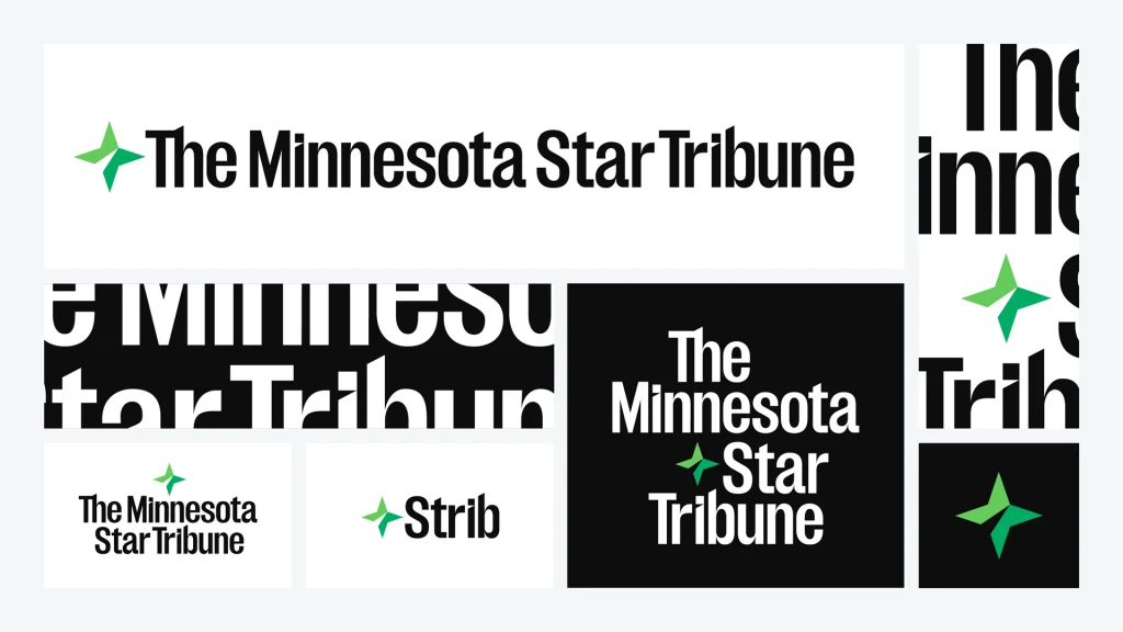
To communicate that change to the world, the newspaper has pulled out all the stops: a digitally enhanced website rebuild; new wordmark set in a sans serif font that is just the right amount of swank; a new logo that swaps out the old five-pointed star for a four-pointed one, reflective of North Star imagery; a new brand platform, “The heart and voice of the North” (which reads a bit like a tagline from Game of Thrones); even a new mascot, Stribby, the Gray Duck (after the paper’s nickname, the Strib), that comes with a North Star tattoo on its neck and an amusing, if a bit tortured, bio.
A hopeful model for the local news
The rebranded Minnesota Star Tribune is the result of a long collaboration among the paper, the Minneapolis-based creative agency Colle McVoy, and the digital creative agency Code and Theory, which has worked with more than 200 news organizations and publications including NBC, CNN, the Daily Beast, BBC, and The Outline (RIP).
As is often the case, the idea for a rebrand was born soon after the then Minneapolis Star Tribune hired former Google exec Steve Grove as its new publisher and CEO in April 2023. (Grove previously served as the commissioner for Minnesota’s Department of Employment and Economic Development under Governor Tim Walz—the Democratic Party’s latest “weird”-slinging, camo-clad darling.) Keen on bringing a digital focus to the 157-year-old newspaper, Grove then hired the paper’s very first chief product officer, along with half a dozen other strategic leadership positions, such as VP of communications and brand marketing, senior vice president of consumer growth, and its first head of philanthropic partnerships.

There were larger factors at play, too, namely the business model that once powered local newspapers around the country is now clearly failing. According to a recent report by Northwestern University, a staggering 204 counties in the U.S. today have no news outlets. Since 2005, the country has lost almost 2,900 newspapers, and those that remain are fighting to stay afloat, as print-advertising revenue continues to plummet.
The Minnesota Star Tribune‘s rebrand was likely possible thanks to an undisclosed cash infusion by its billionaire owner Glen Taylor, who acquired the newspaper—and saved it from bankruptcy—in 2014. But it is nonetheless a testament to how a traditional paper can adapt, and hopefully thrive, in the digital age. “Local media has never been more important to having an informed public,” says Chris Iles, VP of communications and brand marketing for the Star Tribune. “Our hopes and aspirations are that we can establish a model for local news that can be replicated nationwide.” (At present, the paper’s print circulation is about the same as its digital one, but the team is hoping the new site can help them boost digital subscriptions by 200% over the next five years.)
A legacy newspaper doubles down on its digital transformation
For the Minneapolis Star Tribune, that model began with a total digital transformation. The paper invested in a complete digital reboot that includes a new website and mobile app. Laurence Adrian, senior director of design transformation at Code and Theory, says the old website was dense and text-heavy in a way that felt alienating, especially to younger audiences. The new site is comparatively light and peppered with images, but that’s just scratching the surface.

The new design system can flex and scale to meet various journalistic requirements such as breaking news and immersive storytelling. It also features more premium sponsorship opportunities, top banners, and integrated sponsor content because “old revenue models don’t work anymore,” says Adrian. (The new tech powering the site was put to the test when the state’s own governor was announced as Kamala Harris’s VP pick—and the site didn’t even blink, he says.)
At first glance, the paper’s new homepage resembles that of the New York Times, which is no coincidence. The team purposefully looked up to the Times for best practices but, according to Adrian, both sites feel similar because they share good user experiences. “It’s important not to reinvent the wheel and not to create unnecessary UX,” he says. “We don’t want to teach a new behavior unless it’s completely necessary.” The new site may seem overly simple, but it’s certainly easy to read.
Building a new brand—and sparring a bit
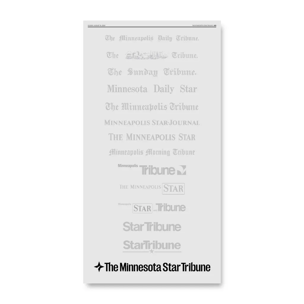
The Minnesota Star Tribune was born the Minneapolis Daily Tribune in 1867. Its first wordmark was set in the gothic lettering that dominated newspaper titles at the time (and still graces such legacy institutions as the New York Times and Washington Post.) Over the years, that typeface (along with its wordmark) has changed half a dozen times, often alternating between blackletter and various sans serifs. So, when the time came to choose a new look for the new paper, a “spicy debate” arose, says Matthew Ulstad, design director at Colle McVoy’s boutique design firm, 10 Thousand Design. Should the paper honor its 157-year-old legacy with a refined blackletter type, or look to the future with a sans serif?
The team spent weeks playing out both concepts, until the pros of a sans serif outweighed those of blackletter (although Ulstad points out that both directions were equally valid). What ultimately tilted the scales toward sans serif was the fact that a newspaper logo no longer just shows up on a masthead. “Yes, the masthead is very prominent in print and digital, but how is this brand going to exist in the world?” says John Neerland, VP group creative director at Colle McVoy, noting that the team spent a long time visualizing both logos on the side of a truck or on a T-shirt. “There are pros and cons for both, but we like where we landed,” he says.

To get the brand right, the Star Tribune team spent more than a year conducting what it calls “listening tours” with community members across 14 cities in the state, while Colle McVoy conducted its own separate research into overall news consumption habits.
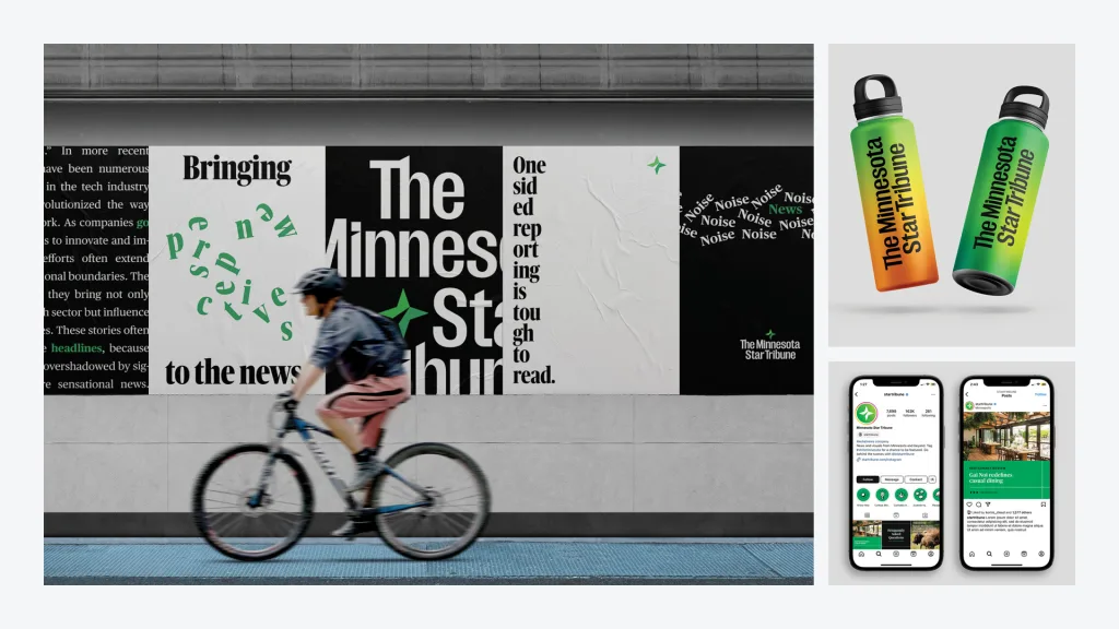
One shared finding: that the Star Tribune was sometimes perceived as a stodgy, elitist publication. A blackletter logo would likely not have helped dispel that image. “Brands almost become utilities like your water or electricity—something you rely on, but you take for granted and maybe you only notice if it goes away,” says Neerland. “That’s why it was so crucial to get the design right and get the voice and the tone and the UX right, so this can be a brand that lives for another 150 years.”
Whether the brand does live on for another 150 years will likely depend on a few more factors, including, even, how people feel about the paper’s new tagline, which favors the North over the Midwest in its positioning. It’s unclear where exactly the tagline will appear, but Iles, the Tribune’s brand marketing VP, explains that there’s a unique set of challenges that come with living in this part of the country, so it was a very intentional choice to lean away from the “ho-hum nature of Midwest” and into the “strength of the bold North.”
Curiously, though, a 2023 study, the largest-ever on Midwestern identity, showed that an overwhelming 97% of Minnesota respondents considered themselves to live in the Midwest. At the same time, the state has a strong historic embrace of the North: Minnesota is called the North Star State; its crowdsourced, new state flag features the North Star; the slogan of its pro football team, the Minnesota Vikings, is “Defend the North”; and of course, there’s the state’s motto, L’Étoile du Nord—French for “the Star of the North.” (In 1861, when Minnesota achieved statehood, it was the northern-most state in the union, the French fur trade was a significant industry, and having its state motto in French paid tribute to this connection.)
And if the tagline doesn’t convince everyone, perhaps the paper’s new four-pointed-star logo will do the trick. The North Star, after all, marks the direction of true North, which, aside from being a reliable compass, symbolizes the guiding principles of truth and integrity in journalism.