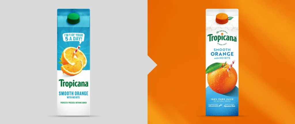
A red-and-white straw sticking out from a juicy orange. Retro-inspired typefaces. Bright, eye-catching colors. Tropicana’s new look is bursting with visuals that harken back to a nostalgic childhood breakfast—and it’s everything the company’s last rebrand failed to be.
The new design was created by the U.K. brand and packaging-design agency Sunhouse after its longstanding partnership with Tropicana Europe products. It’s what marketers might call a “refresh” rather than a full “rebrand.” Instead of overhauling Tropicana’s entire visual identity, Sunhouse spruced up the company’s existing assets using inspiration from the archives, bringing a modern touch to a brand that was founded in 1947.
“The juice category was viewed as a commodity and in decline, with many consumers choosing own-label over branded options,” says Sally Knapton, Sunhouse partner and executive creative strategy director. “The juice landscape had become a sea of sameness, and Tropicana was trying to compete on functional benefits rather than investing in the brand to build affinity and long-term growth.”
Now, Tropicana is pivoting to reestablish its authority as one of the country’s first packaged juice brands, which made it a pioneer in the space (and a key figure of many childhoods). It’s a shift that pairs well with Tropicana’s new campaign, “THAT juice”—meaning, in Gen Z parlance, Tropicana wants to be the It girl of orange juice.
Tropicana’s tasteful 2024 refresh shows that it learned a valuable lesson from 2009, when the rebrand took away the iconic orange pierced by a straw, simplified the logo, and flipped it vertically. Customers hated the rebrand so much, and protested so vehemently, that Tropicana, with its tail between its legs, pulled the new packaging from shelves altogether. Although one lone detail of that rebrand—changing the cap to look like a tiny orange—was, to be fair, a really fun idea.

But at the time, consumers panned the new look as appearing cheap, simplistic, and generally unrecognizable. Tropicana North America’s then president said that they had “underestimated the deep emotional bond [consumers] had with the original packaging.” The whole affair reportedly cost Tropicana more than $50 million, and it was such a snafu that it’s since become a case study in marketing courses.
“It’s always challenging to build on a brand with such iconic and established equities, and I’m sure there were good reasons for the 2009 redesign,” says Knapton. “But going purely on what we’d read in the press, it felt like brand sacrilege.” The distinctive brand marque and the established green and straight-from-the-source story with the straw going into the iconic orange had all been stripped away. “The brand felt utterly unrecognizable,” she adds, “with all the craft and detail being replaced by a glass of juice—a category generic.”
It’s unlikely Tropicana’s new refresh will face a similar backlash. Sunhouse has reinstated the pierced orange as the packaging’s central icon, complete with a drop of juice sliding away from the straw. According to James Giles, Sunhouse partner and executive creative director, it’s a visual that “highlights the pure, natural goodness of the product, which is something Tropicana is known for and imitators can’t replicate.”
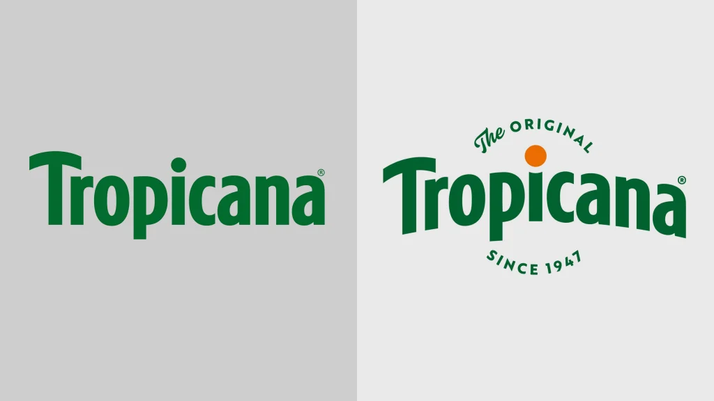
Sunhouse slightly adjusted the Tropicana wordmark, giving it a slight arch and adding an orange dot above the “i.” The agency chose Brother 1816 as a primary font because its rough handmade finish evokes a sense of authenticity. And the phrase “The original since 1947” is added in a roundel to the logo for a retro look, emphasizing Tropicana’s decades-long heritage. And, to top it off, the orange cap is back.
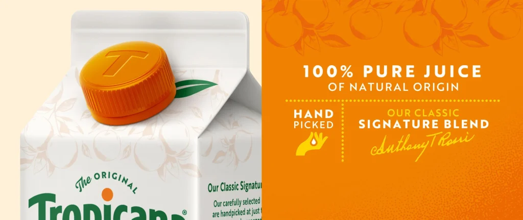
“That detail from the 2009 rebrand felt like the smile in the mind that was missing from the identity anywhere else on the packaging,” Giles says. “It reinforced the purity of the fruit story in a playful way, and we were eager to reintroduce it as another detail to emphasize the ‘straight from source’ real fruit promise in a memorable way.”