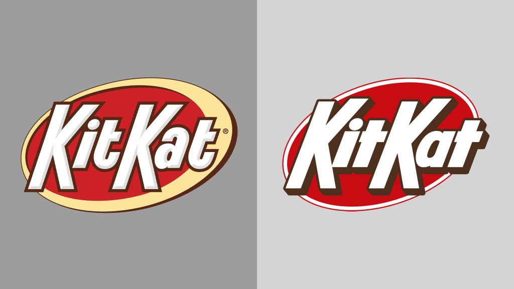
Kit Kat’s new logo is going king-size.
The U.S. version of the candy bar sold by the Hershey Co. has a new logo with bulkier, straighter type and a dark drop shadow set against a simple oval.
Clik here to view.

Gone are the curved t’s and inner shadow on the lettering. These are letters that are meant to look as if they’d give a loud snap when broken clean in two. Sterling Brands, the agency behind the rebrand, said it “celebrates the crispy, creamy taste of Kit Kat, activating the brand with the upbeat, kinetic energy of Kit Kat’s iconic ‘break.’” The agency has also redesigned food and snack branding for the likes of Welch’s and Nestlé Coffee mate, and it has an eye toward simple, colorful packaging.
Internationally, Kit Kat bars are produced by Nestlé and have an entirely differently logo. But in the U.S., Hershey’s newly designed Kit Kat packaging rolled out earlier this year. It doesn’t seem too different than what consumers are used to. The size and shape of the packaging is the same, as are the basics of the logo. It just looks cleaner and a little bit retro.
The rebrand comes as the Hershey Co. looks to boost its candy sales. On the company’s most recent earnings call, CEO Michele Buck said consumers were pulling back on discretionary spending, but the company was pleased with the growth of its confection and salty snacks categories. It’s launching a new gummy Jolly Rancher, and Shaq-a-licious, an extra-large gummy, with Shaquille O’Neal. But as much as new products can drive sales, sometimes all you have to do is repackage an old favorite.
