This week, the Harris-Walz campaign subtly updated its logo, Liquid Death debuted a surprising new flavor, and Bolthouse unveiled a colorful rebrand. Here is the branding news stories we’re following.
Harris-Walz campaign logo refresh
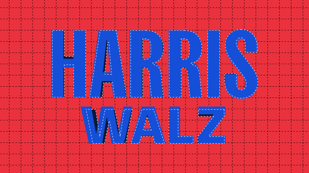
The news: Last weekend, the Harris-Walz logo got a touch-up—but you probably didn’t notice. The changes are so subtle that they barely register to the naked eye. From a closer view, they make the wordmark more symmetrical. It’s the baby botox of political rebrands.
Big picture: The tiny tweaks like centering the crossbar in the “H” address some initial concerns from design critics, who noted imbalances in the original look. Renowned typographer Jonathan Hoefler, who designed the Gotham typeface used by the Obama campaign, called the adjustment a “haircut.” It’s also a good symbol for the overall tenor of the Harris-Walz campaign’s design: Moving at breakneck speed, repeatedly reinventing itself, and staying flexible to change.
Why it matters: Beyond characterizing this particular campaign, the logo’s mini facelift demonstrates just how crucial political branding is to shaping public perception. When two simple words need to project stability, trustworthiness, and a forward-looking perspective, every millimeter counts.
LIQUID DEATH AND VAN LEEUWEN CRACK OPEN SUNDAE SPARKLING WATER

The news: Move over lime, grapefruit, and berry: The next hottest sparkling water flavor is hot fudge sundae. At least, that’s what Liquid Death wants you to think. The brand’s new collaboration with Van Leeuwen is exactly what it sounds like—20 calorie ice cream-flavored water. Yum?
Big picture: Liquid Death has pioneered the entertainment-ification of the beverage industry. The company’s marketing stunts aren’t so much about the product itself, but about cultivating a loyal following around a brand reputation that puts comedy at the forefront. In a recent interview with Fast Company, Liquid Death CEO Mike Cessario explained, “We’re setting out to be an entertainment company that monetizes via beverages.”
Why it matters: Other companies are quickly picking up on Liquid Death’s beverage monetization strategy, which boosted it to a $1.4 billion valuation earlier this year. Its success suggests stunt marketing isn’t going anywhere any time soon. In fact, we likely that we have Liquid Death to thank, in part, for water marketed like beer, 7/11’s hot dog sparkling water, and even a company that’s literally called Weird Water.
BOLTHOUSE FARMS IS THE LATEST SHOPPY SHOP DUPE

The news: Bolthouse, the maker of pre-packaged smoothies, juices, and baby carrots, just debuted a colorful rebrand for its carrot portfolio. If parts of the new look seem familiar—like its font, color-on-color palette, and general approachability—that’s because it is. The rebrand takes after several notable private label CPG rebrands from the past few years, making it the latest shoppy shop dupe.
Big picture: In 2019, Target released its Good & Gather food brand, characterized by an eye-catching color palette and stylized graphics. And in 2024, Walmart debuted a private label, called Bettergoods, with its own vibrant colors and bubbly wordmark. CVS rebranded its private label shortly after. Good & Gather, Bettergoods, and CVS’s WellMarket aim to position themselves as affordable and healthy. Now, Bolthouse is trading its busier, 2000s-esque branding for something that seems strikingly similar to the aforementioned examples.
Why it matters: Target, CVS, and Walmart’s similar branding strategies demonstrate that, to be perceived as an upper-scale product, a CPG brand needs to play by a certain design rulebook—and build association with higher end products a consumer might already be familiar with, like DTC brands, that have leaned into expressive, colorful packaging design. It seems like Bolthouse has taken the hint.
MARSHALL’S REBRAND KEEPS IT CLASSIC

The news: Marshall, the decades-old audio equipment manufacturer, is bringing its rock ‘n roll sensibilities to the digital age with a full rebrand that encompasses its design system and website.
Big picture: To start, the agency behind the rebrand, Barkas, decided not to tinker with Marshal’s iconic wordmark at all. Instead, they worked to simplify the overall brand system into a small number of components on a box grid. For the brand’s web presence on marshall.com, Barkas incorporated plenty of retro touches in the photography and graphic design, emphasizing the energy and emotion that comes with the rock ‘n roll genre.
Why it matters: The redesign is a strong example of balancing nostalgia factor with a forward-looking visual perspective. Instead of conforming to the aesthetics of other modern audio equipment companies—which tend to sport a minimal, subdued look—it embraces a grittier, more colorful vibe that calls back to Marshall’s inception in the early ‘60s in a contemporary way.
HOW SOFT SERVICES MADE ITS FIRST BRAND COLLAB STAND OUT

The news: In a new collaboration, cult favorite skincare company Soft Services and perfumery DS & Durga are making bar soap sexy.
Big picture: The two companies recently joined forces to create a limited edition exfoliating buffing bar with an identity that interprets both of their visual brands in a new way, rather than simply smacking both their logos on the package. Its bright pink packaging, complete with lusciously detailed illustrations of a fig and an eyeball, is meant to evoke the seduction of a “juicy summer night.”
Why it matters: The new launch demonstrates the power of visuals in selling a body product online. Since customers can’t actually smell or feel the exfoliating bar for themselves, the images have to do all of the heavy lifting—conveying texture, scent notes, and even a specific feeling through photography alone. This is a standout example of executing that well.
It also marks Soft Services’s first-ever brand collaboration, and a next chapter for the company as it looks to expand its customer base in 2024. (It also launched a partnership with Sephora back in February, and is now in half of its U.S. stores.) This is also a dip into freshly scented waters for DS & Durga, which is looking to further expand its bar soaps product category.
(Missed last week’s branding news? Here’s what happened.)